Make the subject visible
A phone, a report or a photograph introduces the topic before the supporting text is read.
GOBLU / WORKING STUDENT · COMMUNICATION DESIGN
Product stories, partner milestones and seasonal moments. A collection of social media assets I created during my working student role at GoBlu.
Social communicationA product feature needs explanation. A partner milestone needs evidence. A holiday message needs warmth. The design changes with the communication task.
The work spans chemical-management product messages, partner updates, training and industry events. Each post needs a clear entry point while remaining recognizably part of The BHive or its parent company, GoBlu.
I created social media assets during my working student job at GoBlu. This selection brings together my product illustrations, post layouts and seasonal communication. The accompanying motion studies show how the artwork can extend into an animated portfolio presentation.
THE VISUAL LOGIC
A phone, a report or a photograph introduces the topic before the supporting text is read.
Prominent headlines and a dominant image establish a reading order. Secondary detail carries the context.
Teal supports product recognition; photographic layouts carry evidence; seasonal palettes give greetings their own emotional register.
The featured illustrations connect digital functionality to the factory environment. Familiar objects give technical messages a concrete point of entry.
Hover to play. On touch screens or with a keyboard, use Play motion. Each still shows the final frame.
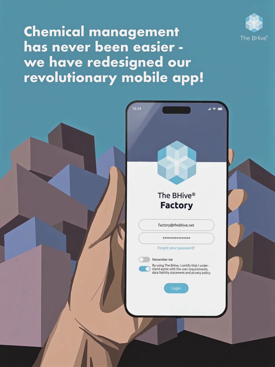
The oversized phone anchors the composition in an everyday action. Factory forms behind it establish the industrial setting. The headline carries the update; the illustration makes its context visible.
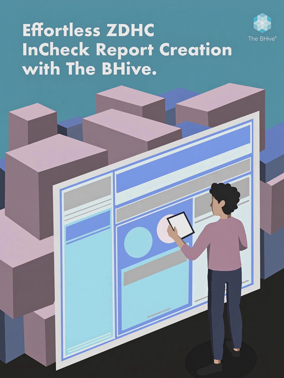
A large interface gives an abstract reporting task a recognizable form. The person establishes scale and interaction, while the surrounding buildings keep the message connected to factory work. The headline names the feature directly.
Original social artwork, presented here through recent portfolio motion studies. These animations extend the original static designs.
WHY THIS STYLE
Isometric building forms create depth without a crowded background. The phone and interface remain the focal points because of their scale and placement. Muted architectural colors support the brighter screen and headline instead of competing with them. Motion adds a second viewing mode; the complete composition remains available as a still.
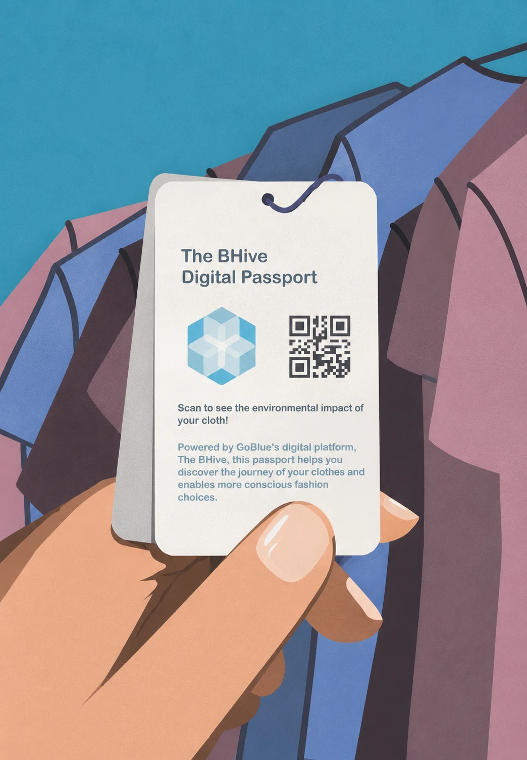
PORTFOLIO EXTENSION / DIGITAL PASSPORT
A card held in front of garments gives the passport idea a physical context. The QR code becomes a recognizable access cue, and the product name remains visible on the card.
The illustration develops the same object-led approach as the app post: one familiar interaction introduces a technical service. This recent portfolio adaptation explores a further application of the visual language.
For partner and event communication, the visual task changes. Report excerpts and photographs establish the subject; a consistent layout connects each story to the brand.
A white card isolates the report excerpt against the teal gradient. The framing keeps the partner’s evidence prominent, while the message beneath explains the connection to The BHive. Figures belong to the quoted partner report, not to a measured outcome of my design.
The report cover is the main visual anchor. A restrained frame separates it from the background, and the supporting copy names the partnership. The layout gives the published material room to speak before adding the brand’s context.
WHY THIS STYLE
The shared teal gradient, top-corner logo and inset report frame create continuity even when the source imagery changes. White space inside the frame distinguishes the evidence from the caption. This approach fits a professional audience because the visual emphasis remains on the partner’s published material.
The workshop photograph establishes a real learning setting. A darkened lower area gives the recap text contrast, and the thin teal rule creates a transition from photograph to message. Attendance figures are part of the original post copy.
The room and presentation screen provide the context. The logos connect the event to the product and company, while the lower caption explains the occasion. Photography is appropriate here because the event itself is the story.
WHY THIS STYLE
People, venue and presentation screens make the event specific. Repeated corner marks and a lower text zone keep the layouts connected. The photograph carries the detail; the caption supplies the takeaway. This is a flexible communication system across different source images.
A closer crop gives the speakers greater visual emphasis. The caption identifies the subject of the talk, while the teal divider maintains continuity with the wider event series.
The wide room photograph foregrounds the gathering rather than an individual speaker. The concise caption provides the event context. The same corner logos and divider connect this broader view to the speaker post.
GoBlu’s seasonal posts use a softer illustration language. An occasion-led palette and one central motif give each greeting its own character.
Stacked gifts turn the message into an immediate seasonal cue. The lavender field softens the tone, while the white headline and GoBlu mark retain a clear reading order. The dark base gives the illustration weight and keeps the composition grounded.
THE REPEATABLE IDEA
A greeting in the upper left, a small company mark in the upper right and a dominant illustration below create an adaptable structure. It allows seasonal variation while preserving the relationship between message, sender and image.
The three recent adaptations below extend the supplied holiday direction for this portfolio. They are presented separately from the original working student asset.
Earthy brown and candlelight support the greeting’s emphasis on rest and renewal. The clustered arrangement creates one focal group, while the headline remains clear above it.
Patterned eggs and sprouting foliage make the occasion recognizable. A muted green field connects the image to growth; varied egg sizes create rhythm without changing the overall layout.
Interlocking ribbon-like forms visualize togetherness. Blue gives the greeting a calm tone, while contrasting cream, teal and yellow help the individual forms remain legible within the shared motif.
This collection shows how I adapt visual communication to different messages while maintaining clear hierarchy and recurring brand cues.
Product illustration, typography-led layouts, photographic communication and seasonal variation. The range is connected by a practical design question: what should the viewer notice first, and what information needs to follow?
I would compare headline readability at actual feed size, test alternative crops for event photographs and review how each format performs with its intended audience. The case study documents design decisions and deliverables; it does not claim measured engagement or business impact.
GOBLU / TWO COMPLEMENTARY CASE STUDIES
Together, the projects show both the ability to develop a visual direction and the judgment to adapt communication across different types of content.