Keep a point of recognition.
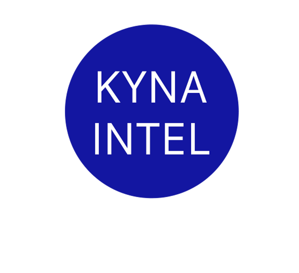
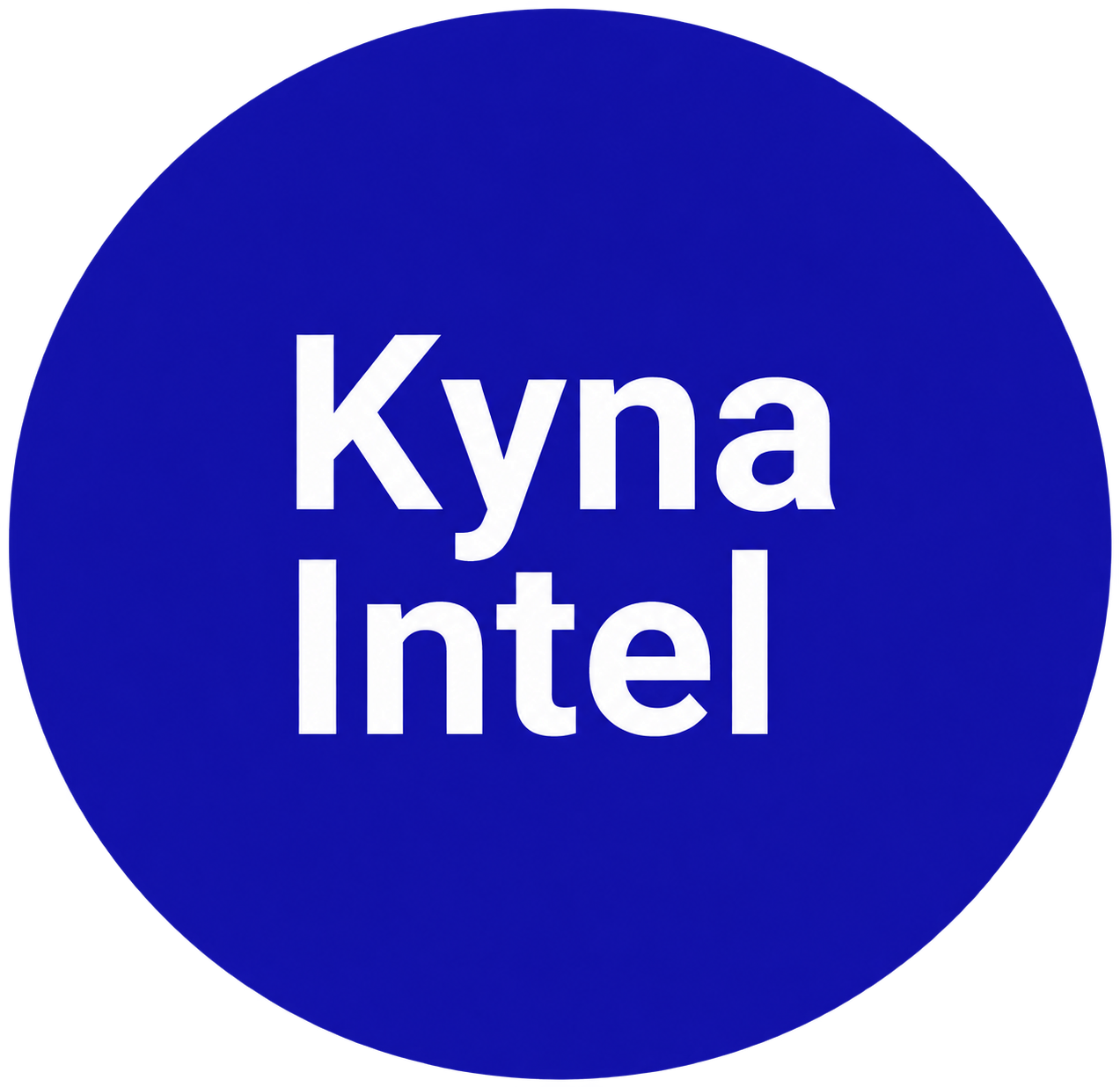
Retain the blue circle while changing the wordmark’s tone through capitalization and weight.
GOBLU · PRODUCT IDENTITY & COMMUNICATION DESIGN
As a working student in communication design at GoBlu, I proposed a new logo direction and developed an approved identity across icons and social assets.
Textile & fashion intelligence
Germany · Working student project
01 / BRIEF, ROLE & REASONING
Kyna Intel provides industry and supplier updates for textile and fashion professionals. GoBlu wanted to build the product’s social media presence and awareness. My initial task was to develop its visual communication for that channel.
The design challenge was to connect several product messages—updates, alerts, legislation and information resources—under one identity. Each post needed its own emphasis without feeling like a separate product.
MY CONTRIBUTION / WORKING STUDENT
While exploring the product, I felt the existing wordmark could be more inviting. I proposed a new logo direction to the team. I worked back and forth with my manager on the direction and its execution. After approval, I carried the direction into iconography and social media assets.
This expanded my contribution from individual posts to a connected set of design decisions: how the name appears, how topics are represented and how each message sits within a recognizable layout. The feedback process helped me develop the proposal into work my manager was satisfied with, then apply the direction across the wider identity.
THE DESIGN LOGIC
Retain the blue circle while changing the wordmark’s tone through capitalization and weight.
Use a consistent palette, prominent headline and recurring logo placement to connect the social posts.
Use distinct symbols and illustrations to introduce the subject before the viewer reads the supporting copy.
02 / LOGO EVOLUTION
The blue circle provides continuity. A change in typeface, weight and capitalization gives the name a different voice.
WHY THIS CHANGE
I replaced the all-capitals treatment with initial capitals and a different typeface to make the name feel more approachable. The heavier letterforms give the name more visual emphasis within the circle. Retaining the original container allowed the change to focus on the voice of the wordmark. Approachability was the design intention; the visual comparison shows the decision itself.
03 / VISUAL LANGUAGE
The system combines a stable brand foundation with flexible topic imagery. The colors and typography repeat; the illustration changes to match the message.
#150FA8The identity’s anchor.
#DED4FALightness and contrast.
#4B475FDefinition and depth.
Color values sampled from the supplied logo and icon artwork.
TYPOGRAPHY
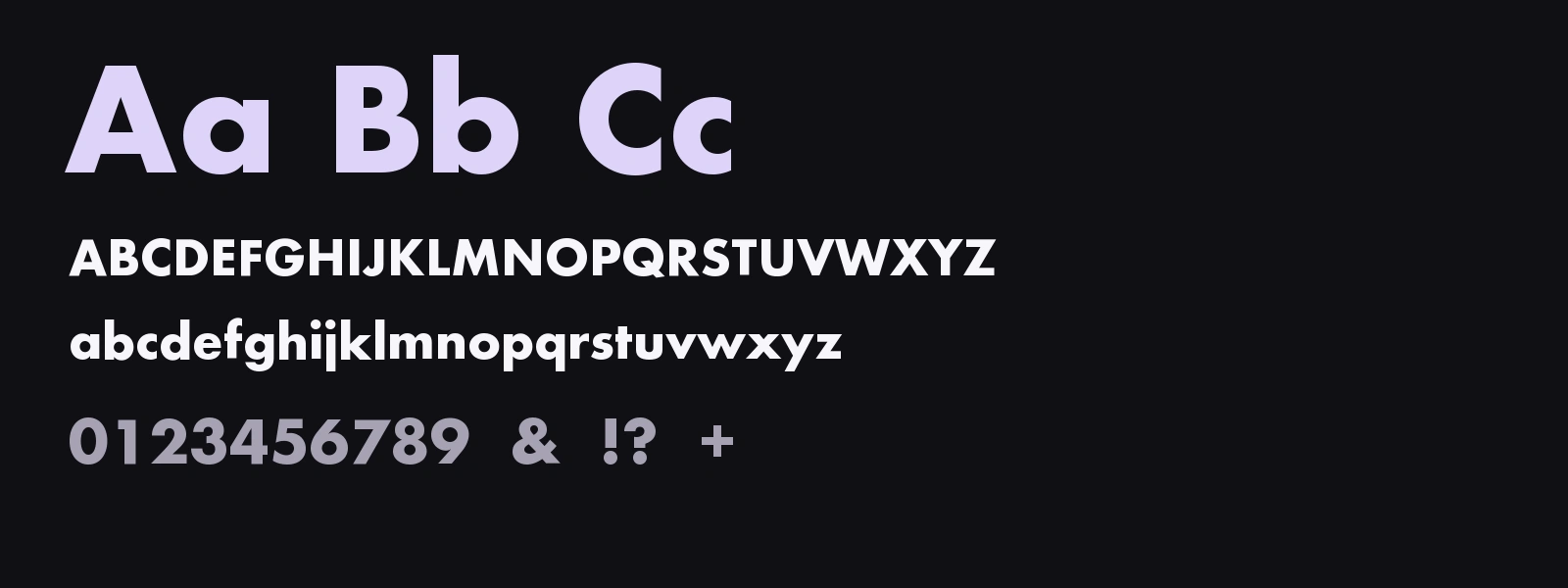
The geometric letterforms give the social headlines a direct, confident voice. A strong weight supports a clear hierarchy against the blue backgrounds, while generous space keeps each message distinct.
THE ICON SYSTEM
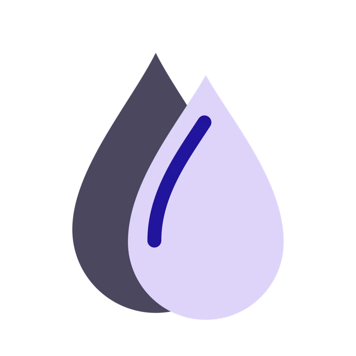
Sixteen environmental and social topics, connected through a consistent palette and expressive silhouettes. Scroll to explore the collection.












04 / SOCIAL COMMUNICATION
The posts explain four different product benefits using the same hierarchy: logo for recognition, headline for the message and a dominant illustration for the topic. The motion studies extend this visual communication for the portfolio.
Hover to play. On touch screens, tap a post. Each still shows the final frame.
A REPEATABLE COMMUNICATION STRUCTURE
A refresh symbol gives the promise of current information an immediate visual cue.
The bell turns supplier notifications into a familiar, direct message.
The gavel anchors a complex topic in a recognizable illustration.
The newspaper stack translates a broad information base into a tangible visual.
05 / DELIVERY & NEXT STEPS
The team approved the logo direction, which I developed into a coordinated set of icons and social media assets. The project demonstrates my contribution from identifying a design opportunity through to producing the visual applications.
A redesigned wordmark that retains the circular blue mark.
Sixteen environmental and social topics within a shared palette.
Social assets that connect individual product features to a consistent identity.
COLLABORATION & RESPONSE
I developed the work through ongoing exchanges with my manager, who was satisfied with the final result. The new LinkedIn campaigns received more likes and comments than earlier posts. During product demos, new clients mentioned having seen the campaign online—a qualitative sign that the communication was being remembered beyond the feed.
Project observations based on LinkedIn response and client comments during demos. These observations indicate recall; they do not establish that the campaign caused new client acquisition.
Original work: logo direction, iconography and social identity, developed during my working student role at GoBlu. The motion studies are a later portfolio extension. The outcomes described here are manager approval, asset delivery and my observations of the campaign response.